TideLand Identity & Collateral
Project Overview
TideLand Construction & Petroleum needed an identity that could clearly communicate two sides of the business: commercial construction and petroleum services.
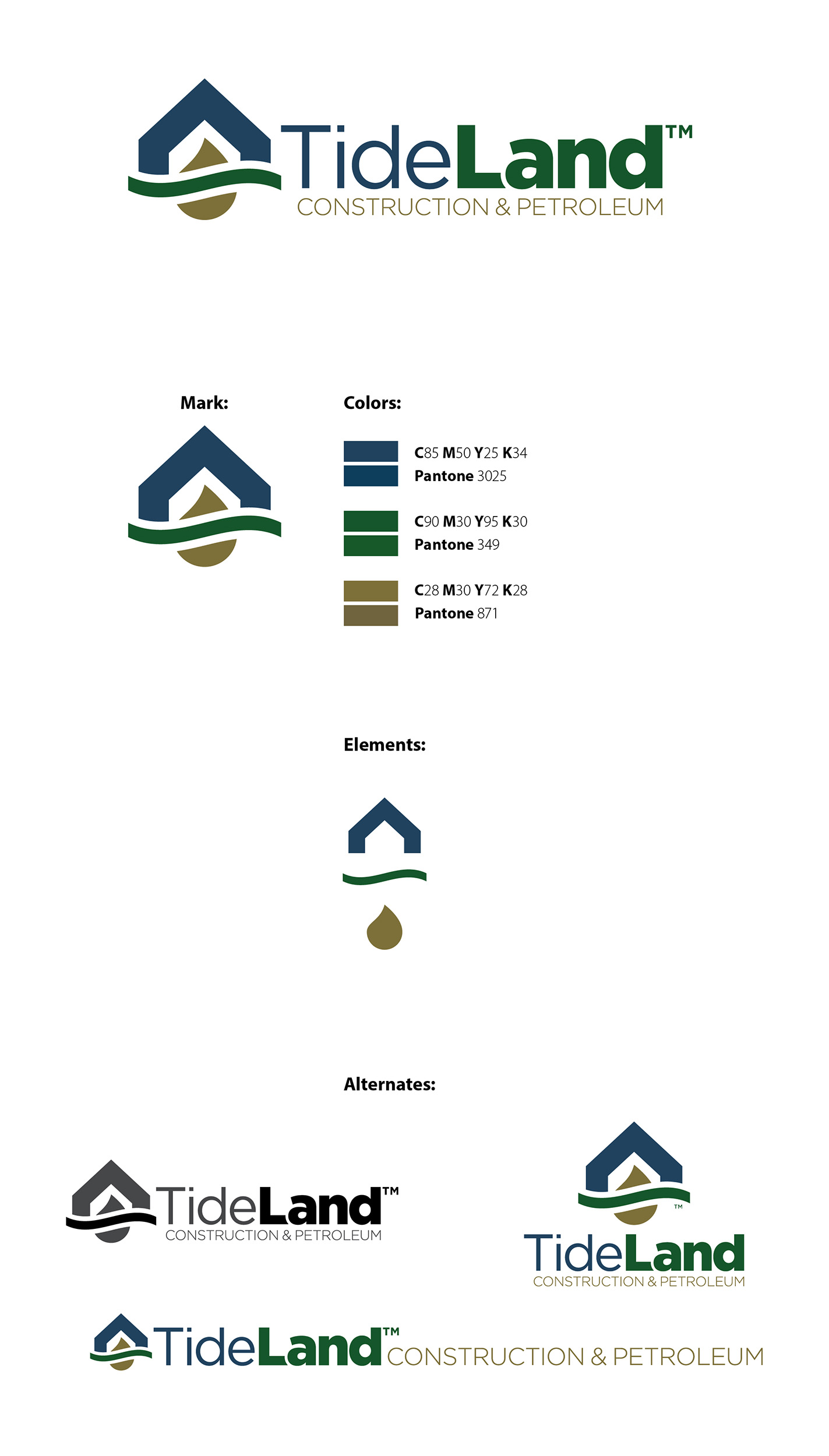
The identity was built around a unified mark combining a structure, flowing horizon and petroleum drop into a single graphic. The visual system uses deep blue, green and gold to reinforce construction, land and petroleum while giving the company a professional established presence.
The system was designed for flexibility across different applications with horizontal, stacked, full-color, one-color and standalone mark configurations. This allowed the identity to work consistently across everything from digital applications to signage and printed materials.
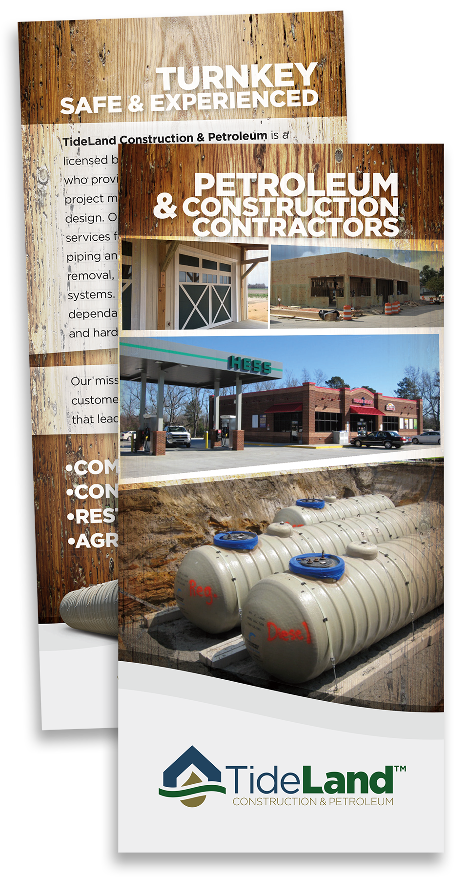
The brand was extended into marketing collateral including a promotional rack card, using bold typography, project photography and construction-inspired textures to communicate TideLand’s turnkey capabilities and industry experience.
The result is a practical identity system built for a company working across multiple disciplines while keeping everything under one recognizable brand.