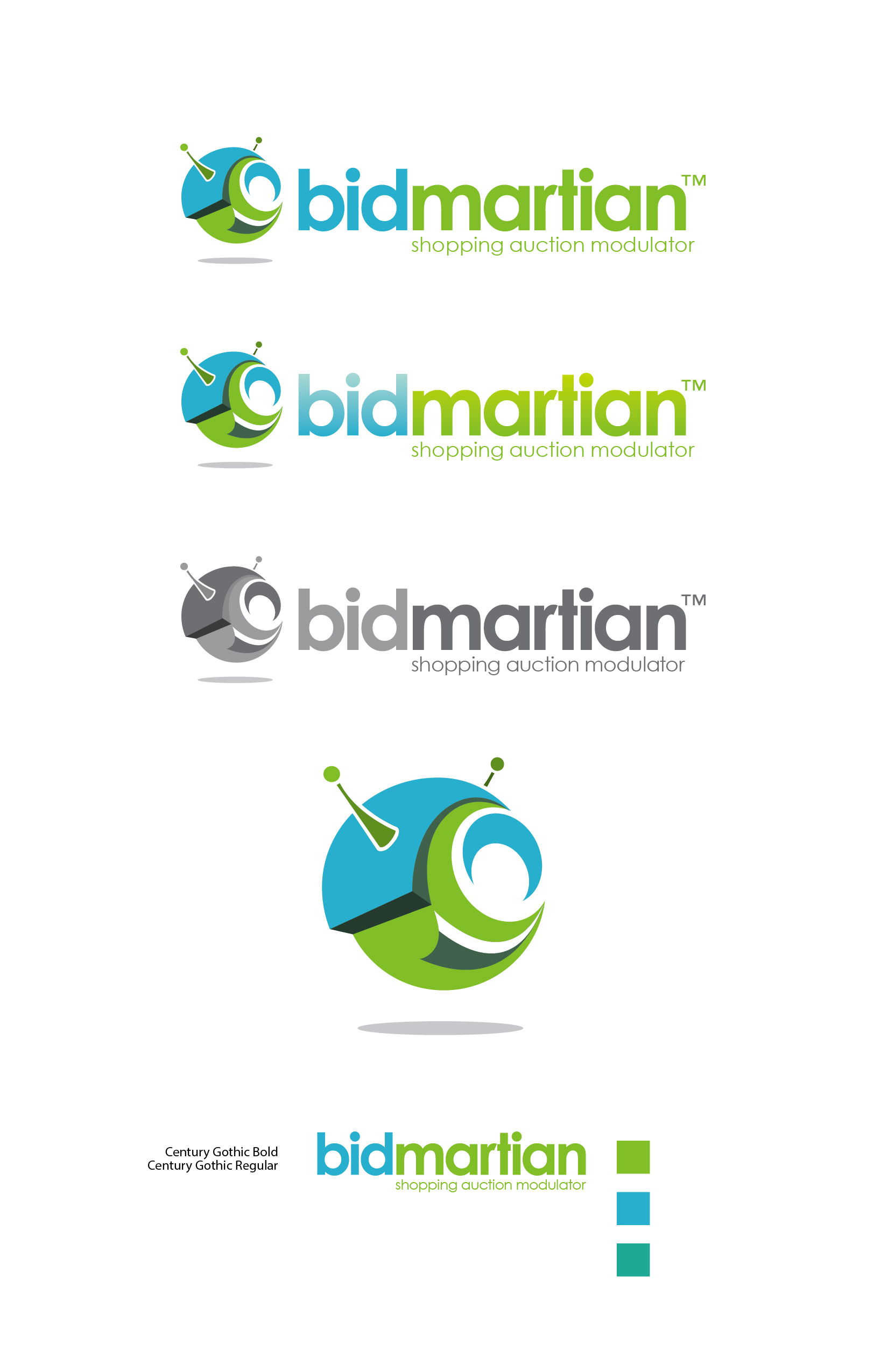
BidMartian Logo
Brand Direction
The identity was designed to feel futuristic, intelligent and slightly playful—positioning BidMartian as a next-generation auction platform rather than a traditional marketplace. The goal was to visually communicate innovation, motion and interaction.
Concept Development
The core idea centered around a “Martian” presence—an abstract, friendly alien form representing exploration and new territory in digital commerce. The circular form suggests continuity and cycles (bidding), while the antenna elements hint at connectivity, signals and real-time interaction.
Form & Symbolism
- Orb Shape: Represents a self-contained ecosystem—an active marketplace driven by user participation
- Swirling Interior Forms: Suggest motion, bidding cycles and the fluid exchange of value
- Antenna Elements: Reinforce communication, technology and responsiveness
- Shadowing: Adds depth and a floating quality, giving the mark a digital, almost “hovering UI” feel
Color Exploration
The palette was intentionally vibrant and tech-forward:
- Teal/Blue: Trust, technology and digital infrastructure
- Green: Growth, value and financial exchange
- Secondary tones: Add depth and layering, reinforcing movement within the mark
The contrast between blue and green creates a balance between logic (tech) and energy (engagement).
Typography
A clean, geometric sans-serif (Century Gothic) was selected to complement the icon:
- Rounded forms mirror the softness of the mark
- Lowercase styling keeps the brand approachable
- Weight contrast between “bid” and “martian” subtly emphasizes action vs identity
Iteration & Refinement
Multiple logo variations were explored:
- Full color vs monochrome for versatility
- Icon-first vs horizontal lockups for scalability
- Simplified forms to ensure legibility at smaller sizes
Each iteration focused on maintaining clarity while preserving the energy of the concept.
Design Outcome
The final identity balances playfulness and precision—a mark that feels approachable but rooted in a forward-thinking system. It visually supports the platform’s innovative model by reinforcing ideas of motion, interaction and a new way to engage with online auctions.